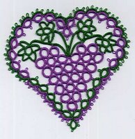
Here is an extreme makeover of a heart I designed a few years ago. This one is in DMC size 80.
Below, I'll describe some of the (re)designing steps.
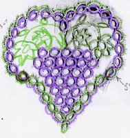
 This was the original. Some of my friends like it just fine, but I wasn't satified. I think the leaves are too large in proportion to the grapes, and that large green area seems unbalanced with the whole.
For the next attempt, I will add another row to the grape bunch and make it a little wider so that it occupies more of the heart interior.
Also, the lower part of the heart outline had been worked with 4 shuttles making 2 chains concurrently. I was trying for an over/under interweaving effect, but the payoff in effect wasn't worth the bother. I plan for split rings with a SLT in between for the next version.
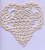
 I work the grape cluster and the heart outline in some old ecru thread. (That's a great use for the old partial balls that came in lots from ebay -- a tip I thank Jane for.) Then I turn to one of my favorite designing tools -- the Xerox machine. I tat a few leaves in different sizes and move them around on the picture like puzzle pieces to see where they can go, and then pencil in some stems.
 I also experiment with some markers to work on the colors. The green foliage at the top needs more green at the bottom of the heart
for balance. I will replace the intertwining bit with green rings.
 This is the actual ecru rough draft with two different versions of the stems. Remember rough drafts will be rough. You can try more than one thing on the same motif or round. There will be big ugly knots and loose threads.
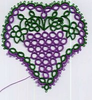
 For the next draft, I change to colored threads. This is showing progress, but not quite good enough yet. The curve at the sides is not smooth enough, which could be helped with changing the points where the leaves join. There is too much overlapping in the stem area which might just need blocking, but probably needs moving the placement of those little rings. What gradually dawns on me, and bothers me most is that the top is too flat and needs more cleft. After a deal of thought, I decide to omit the center ring of the upper row of grapes and pull the outline downward. Of course this will mean major changes to the leaf section.
 So again, I tat the grapes and the outline and do the puzzle piece experimentation with the leaves. Since there's less space available, there are fewer possibilities, which simplifies matters. After one false start which I cut away, I make the version of the leaves and decide it will do.
Wow! that is absolutely stunning.
ReplyDeleteThe explanation was very interesting.
I really like this heart with grapes inside. You did a great job and the explantion of how you progressed is very enlightening. Thanks for sharing.
ReplyDeleteLaura
hmmm..new and improved versions are popular these days. I love this. Since I was looking at hanging clunies earlier, I couldn't help but wonder how a few of those would look in the leaf petals?
ReplyDelete:-) gina
This design is just beautiful. You have a wonderful eye for form and color.
ReplyDeleteThank you as well for sharing your designing steps; it was interesting, informative and I think will be helpful to others who are interested in designing or who are maybe stuck in their own designing process.
Love it love it love it...where and when would you share this one...I love hearts!!
ReplyDeleteArlene
lindo blog , estou aprendendo com ele regina
ReplyDeletelindo blog ! regina
ReplyDelete